AUSSTELLUNG POSTER
Swiss exhibition poster for a historical graphic design gallery event, created through an iterative design process based off of a work by Richard Paul Lohse.

OVERVIEW
This poster was designed with the principle “copy, transform, and combine. ” Taking inspiration from a single work in design history by Richard Paul Lohse. I set to better understand his work by developing a deeper relationship to the piece by breaking it down.
TASKS
- Poster Design
- Iterative Design Process
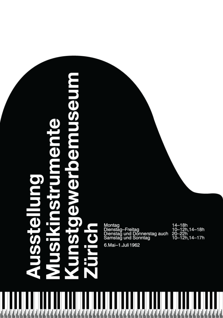
POSTER
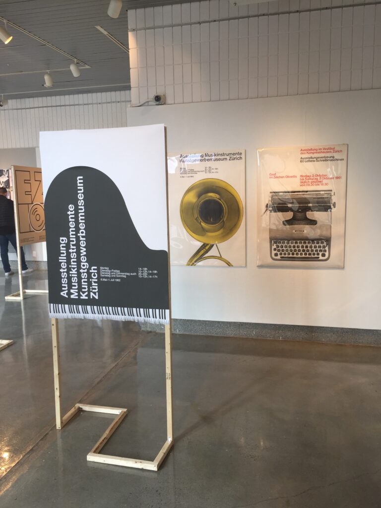
As a combination of findings, this poster is the final product inspired by the historic work and the iterative process. Balancing both form and function, this piece uses its shape and physical identity to guide how the viewer interacts with and observes the poster.
COPY
Richard Paul Lohse designed this poster, on the left, from which I take inspiration. In order to understand his work, I started by copying it, spending time understanding how it was created to inform my own design practices. The result of my replication is seen on the right.
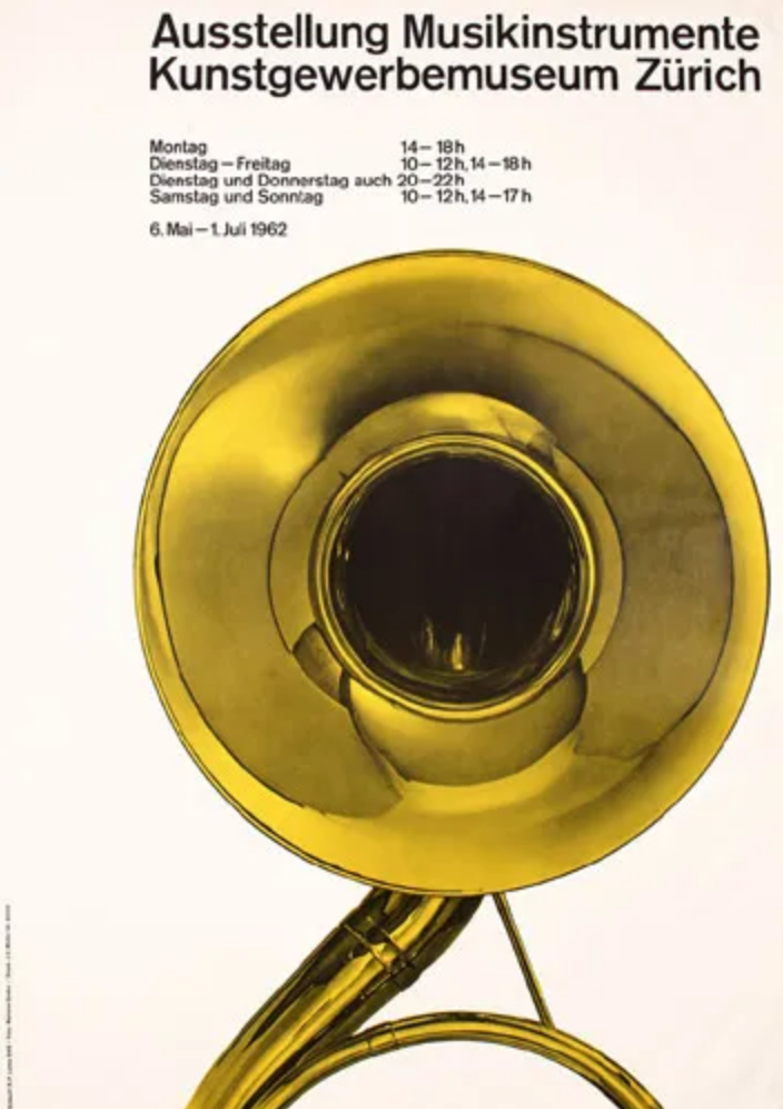
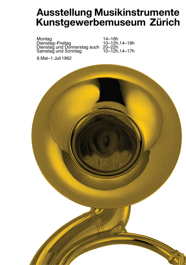
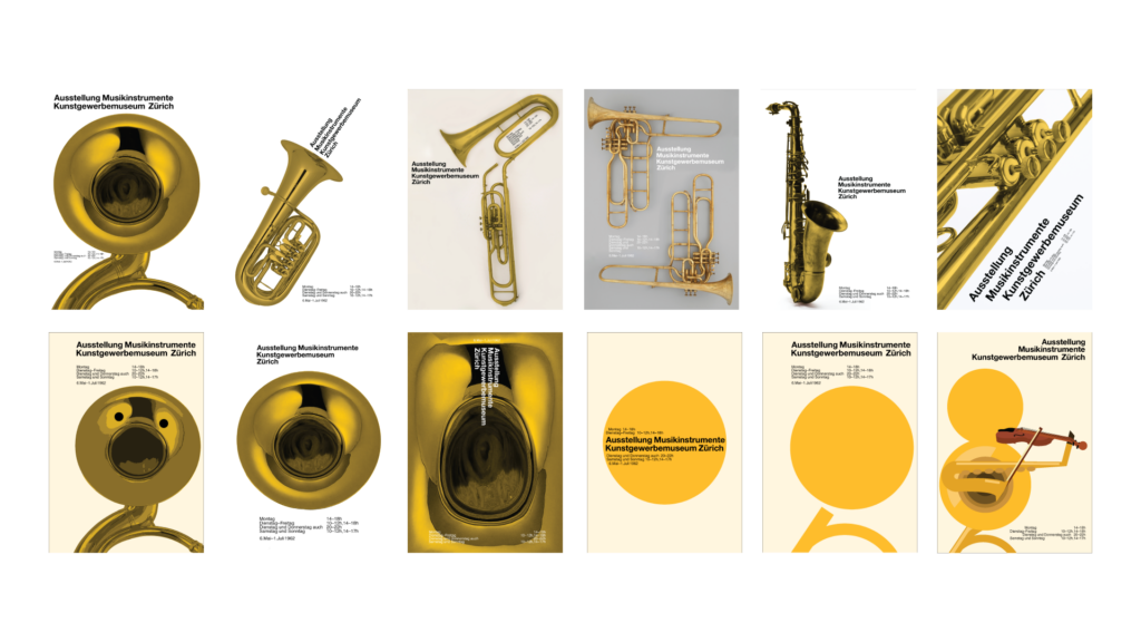
TRANSFORM
The next step was transforming from the original. Generating variations based off of text placement, instrument choice, text treatment, and more. Then, I sought to break down the piece to its basic elements in order to work my way back.
GOING FURTHER
I brought the work to life through animation. Going off the idea of breaking the work down to basic elements, I expanded on the minimal shape approach. I also wanted to expand on the tone and personality to find the right fit. I revitalized the audio from a viral video to bring the work to the modern era. Then, I attempted to take it back a step, applying a more sophisticated tone to the work.
OUTSIDE THE BOX
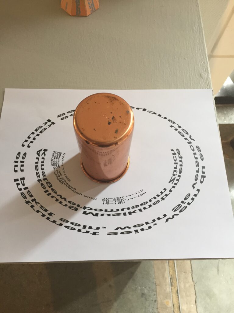
Considering Richard Paul Lohse’s control of the viewer’s eye, an exploration was made into how we can further harness that ability. I found inspiration in the circular nature of the instrument, as well as the metallic nature, further relationships to explore. Using anamorphic illusion, a print was created that bends and distorts the text, however when viewed in the reflection of this metallic cylinder, the words become clear and legible.
TACTILITY
A music based poster is not complete without first exploring how to address an audible nature of its subject. Thinking about how to cause people to interact and pay attention to a piece, I developed another interactive based promotional piece. Again exploring the concept of the circle, I utilized a unique circular instrument to turn into a 3D poster. Furthering my development of minimal shapes and representations of instruments, the outside of this chime reflects its internal function. As the user turns the piece, the clapper hits each metal rod within, creating a harmonic experience.
COMBINE
Next I sought to combine my new found understanding from the entire process. My synthesis involved the following:
- The original uses a succesful relationship between the placement of the text and the form of the instrument
- The original's sucess is not based around the printing technique itself
- The instrument is an important focal point
- The choice of displaying the piece as a poster means, the every day person is able to interact and intepret on even ground
- An original interpretation will only come through innovation rather than transformation
- Lohse uses the shape of the instrument to control the way the eye moves along the page
CONCEPT
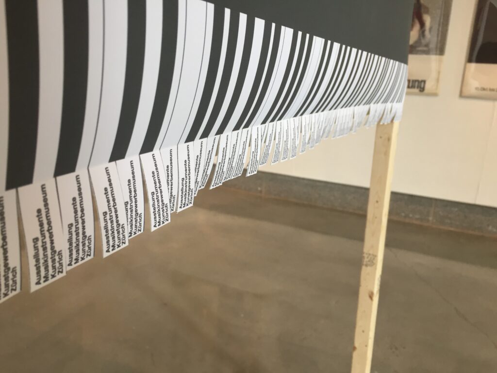
I understood that the act of a poster is to be personal, something on the street at eye level to grasp attention and action. I realized that there is a disconnect between orchestral music and the average person, seeing it viewed as an exclusive for the upper class. I brought down this barrier by using a visual indicator. Everyone who has walked down a street knows the concept of the “take one” flyer. The passerby can rip off a small pre-torn piece as a reminder to attend the show, just like a flyer you would see on a telephone pole. Using this breaks down the barrier of the pristine, exposing it to the everyday. Music should bring people together, not create separations.
FURTHER USE
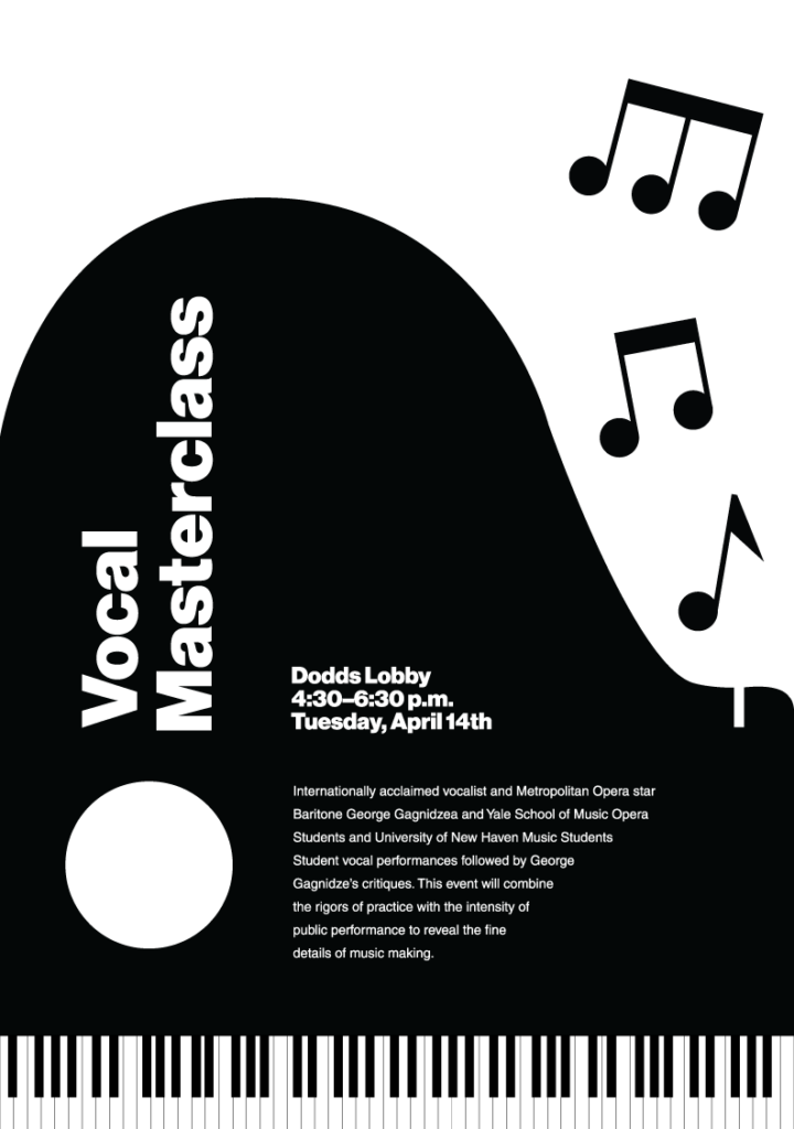
After the exhibition came to a close, I further expanded on some of the concepts and visuals. Again, exploring the relationship of the form of the instrument to the form and function of the text. After the exploration phases, I soon saw a subtle way to include a person singing into the design, fitting the new challenge of designing for a vocal masterclass. This was a new approach to a project, starting with a design and forming it to the needs of the challenge; compared to the usual approach of starting with the challenge or objective and creating a new design for it.
