DATA TRANSACTION TOKEN
Data Transaction Token (XD) is a cryptocurrency digital asset that connects public and private blockchain ledgers.

OVERVIEW
As Chief Creative Officer of Scroll, I created and managed the brand of Data Transaction Token (XD), the cryptocurrency digital asset of its blockchain technology.
SERVICES
- Brand Creation
- Logo Design
- Illustration
- Print Material Design
- Motion Graphics
HOW IT WORKS
Explainer Video
This video provides a look into the technology behind Data Transaction Token (XD). Utilizing motion graphics brought the story to life in this scripted work we created.
Visuals seen within the video are a combination of graphic elements and shapes used throughout the brand. The images were cut up and stitched together, create a unique identity and visual language.

LOGO DESIGN
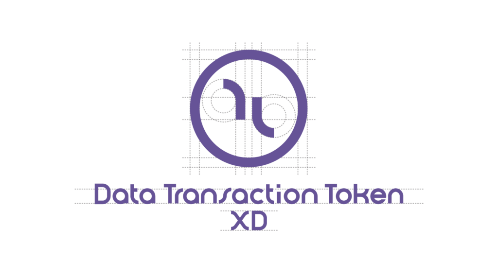
The logo is based around the very concept of movement, just as its name and function. Falling under the Scroll brand umbrella, aspects from the Scroll logo were brought over to strengthen the brand connection. For instance, the icon aspect of the logo, features a dynamic opposition of two mirrored shapes. This unique mark stems from the double “L” in the Scroll logo.
One of the first instances a viewer sees is the logo actually on an exchange; in which case only a small icon is shown, along with a plain text ticker and sometimes the plain text name of the asset. This means that the icon needed to work on a small scale while still identifiable and can stand out. This abstract mark creates a truly unique impression. It fits in with the geometric and abstract style of icons seen across the blockchain and cryptocurrency industries. The other aspect that was used from the Scroll brand is the typeface I created called “Gesture”, a bauhaus inspired type based around circles.
INDUSTRY VALIDATION
Some time after Data Transaction Token (XD) had been released, Facebook entered the blockchain industry with “Calibra”, their cryptocurrency company. Fans quickly noticed similarities between their logo icon and ours. Their logo simply proves validation for the successful style we created. The minimal circular waves with a circular outer element establishes the proper identity in the space. Since then, Calibra has rebranded to Novi for their own reasons not involving Data Transaction Token.
ICONOGRAPHY
This style was developed to match the nature of the rest of the graphic elements we use for the brand. For instance, a heavy focus is placed on outline based graphic elements over filled in shapes. In order to add contrast to the background, we use an offset fill color underneath the main outline. A disrupted or dashed line also makes an appearance in each icon, furthering the “blueprint” and “path” aesthetic.

UI/UX
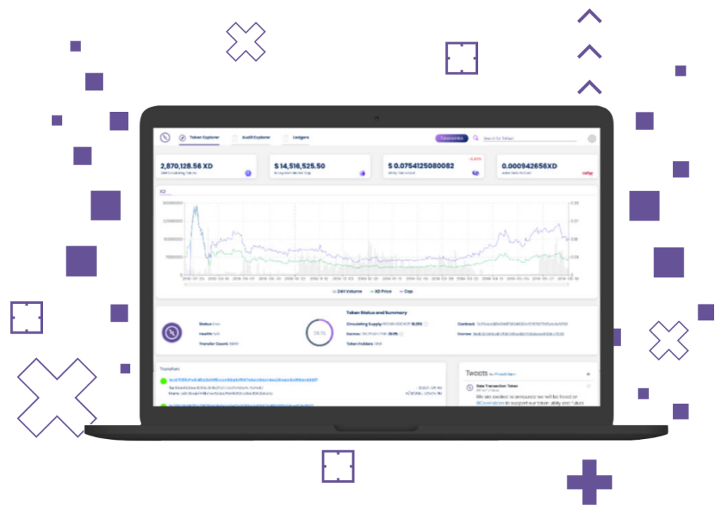
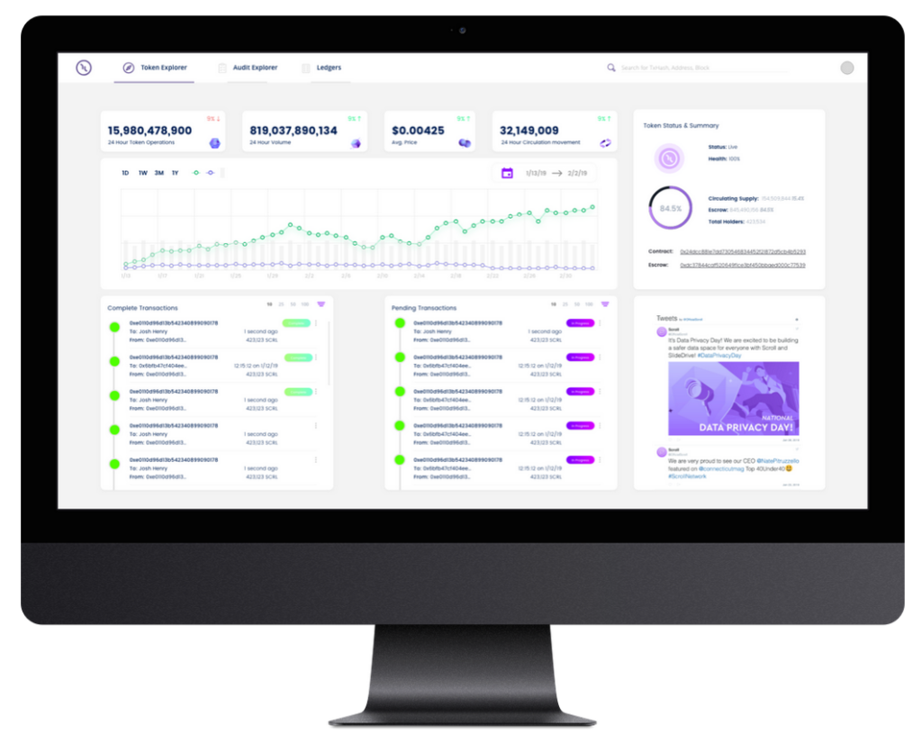
The token explorer allows people to view live analytics of the token’s blockchain. This was designed to organize useful information to be quickly absorbed by the user.
