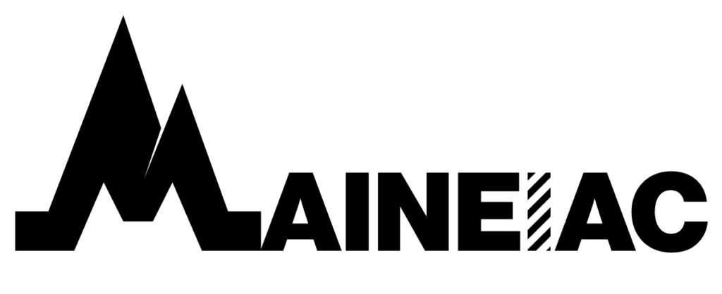
MAINEIAC
A magazine covering the diversities of Maine culture.


OVERVIEW
Creating a logo that encompasses the state’s charm which, notably changes as you head north. I found that Maine is divided into two parts, the north and the south. The south is characterized by the coast line, lighthouses, flat land, lobster, fishing, and more. While the north is defined by its vast wilderness, mountains, moose, and small communities. This logo covers both identities, where the “M” illustrates the mountains of the north, while the “I” symbolizes the iconic stripes of a lighthouse to show the coast. The weight of the mark signifies the bold and tough nature of Mainers, leading with a strong chaotic “M” followed by the peace seen in the rest of the logo. The “I” acts as a divider, allowing “Maine” to be found within the mark, furthering the focus on the great state.
SERVICES
- Logo Design
- Type Design
