A file transfer app that connects your devices into one hub to access files seamlessly across file directories without ever placing a file on a cloud server.
OVERVIEW
As one of the inventors of the app, it was important for me to solve problems in the tech industry. Privacy became a notion of the past, companies using your data or flat out losing it with security risks. With a new found appreciation for privacy, the public demand cried out. As a product of my company Scroll, this app’s brand, marketing, and UI/UX development were under my leadership.
TASKS
- Brand Creation
- Logo Design
- Illustration
- Web Design
- Print Material Design
- Motion Graphics
- UI/UX
- Marketing
- Chief Creative Officer
- Project Management
UI WALKTHROUGH
KEY FEATURES
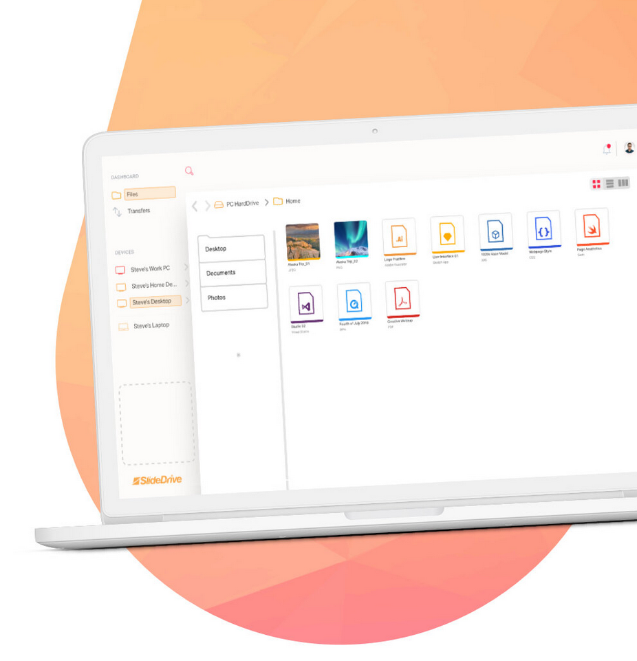
SlideDrive is a simple, easy to use mobile and desktop application that allows you to send any file you wish at just the slide of a finger. Connect to any IOS, Android, Windows, Mac, or Linux device with a secure tunnel from one to the other.
Access files from another device remotely. If you leave a file on your home computer, no need to worry because you can access it on the go. Don’t have much storage on your phone? Use your computer at home to store everything and pull over just what you need.
SlideDrive is a private and secure way to send files. SlideDrive only stores your files on your own devices, keeping the files in your hands and not in the hands of a third party cloud. SlideDrive takes no rights or claims to any of the data you transfer with the service.
SlideDrive offers enterprise solutions for groups of any size. Keeping connected students, businesses, friends, and more.
Forgetting a flash drive is now not a worry. One thing you always have on your is your phone. With SlideDrive your phone becomes your flash drive, with unlimited access to files across all of your devices.
People use their phone everyday as a camera, filling up the phone’s storage in the blink of an eye. SlideDrive allows you to have you photos instantly sent to another device of yours to be stored.
LOGO DESIGN
SlideDrive’s logo revolves around the simple aspect of energy. The high energy is useful for defining the important aspects people want in a file transfer application. The movement in the piece highlights the speed of SlideDrive. The viewer/consumer is left with the implied nature of the product through this first established connection with the brand. The mark is both memorable and current, by keeping up with design trends while innovating typography through the evolving manipulation of type. The bright color emphasizes the focus on this product, the energy, and the positive atmosphere the brand wants to give off.
The icon portion of the logo encompasses the important logo principal of minimalism. By breaking shapes and ideas down to their simplest forms, it creates an iconic and lasting mark. A logo in this field should be simple enough to be drawn in the sand. Here we explored an abstract yet subtle representation of the “s” letter form. The triangles are shifted at a slant, creating potential energy in its off center form. By shifting the triangles, an impending release is creating, leaving the impression of movement.
Logo marks as a whole needs to be able to act both on its own, and in conjunction with its letterform logo accompanying it. This is done through continued brand identity reminders through repetition. By branding from the beginning through constantly using the icon with the rest of the logo, we increase awareness of both the name and the icon paired to the name. This is reinforced through use of the icon in the word SlideDrive as well, here we see it adorning the “I” with its title. The appearance of the icon here is also used to solidify the energy associated with the idea of the brand. A “ramp” is created from the “D” and travels up the “r”, launching the top half of the SlideDrive icon. A comparison is made here between the icon and the sliding of a file, one of the key aspects utilized in the marketing tactics for SlideDrive.

A harmony is created to unite the various letters into a whole, seen in the use of the two types of angular cuts in the form. The first angle is seen in the italics form of the typeface, Akzidenz Grotesk. This angle is used to keep constant motion through the logo as you read, whereas if the non-italic version was used, there would be less energy moving the eye through the word mark. The second angle used as a motif is the angle established in the icon. This angle is again used to move the eye through the logo but used as an aesthetic pairing to the previously mentioned angle. This angle is seen in the icon, the cut of the “S”, the “l”, the “i”s, the “d”s, and the “r”.

ILLUSTRATION

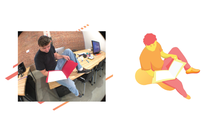
I developed an illustration style for the brand to help animate and visualize concepts and emotions we want to communicate to the end user. Illustrations put a friendly face to the product, while ironically not having a full face at all in this case. The expression is only through the eyes and pose, giving the brand a unique characteristic and attitude. Forms are simplified, using a vector no outline based style. Some of the angles are sharper in different locations to fulfill the angularity of the logo. One of the most important aspects of this style is the interesting composition and/or foreshortening to humanize these piece and separate them from other styles lacking such.
ILLUSTRATION PROCESS
As a style definer, illustrations with an interesting composition through heightened foreshortening is a requirement. Several methods were used to achieve advanced perspectives, illustrations from scratch, illustrations from 3D models we developed, and as you see here, through the use of a fish eye lens for a photographic reference.
DEPARTMENT INTEGRATION
As Chief Creative Officer, one of my responsibilites was to ensure synergy between departments within the company. Breaking barriers between creative, marketing, development, sales, and operations brought streamlined output.
SOCIAL MEDIA AD
This is an example of one of our promotional videos we created for brand awareness. Utilizing Instagram stories, this was featured for a limited amount of time on our page of over 200,000 followers. The story ad showcases fast movement seen throughout the brand, including key graphic elements used in backgrounds across the brand.
ANIMATED HIGHLIGHT
We combined illustration with 3D animation in order to bring attention and focus on the SlideDrive website. This graphic was used to showcase some of the plethora of file types the software can transfer, in an energetic way. File types were chosen to attract the various audiences the software targets, such as creatives, and some of the most common file types. These exact icons used in the application were brought into Cinema 4D and animated, giving them the hovering and growing effect that flows among the objects.
MERCH
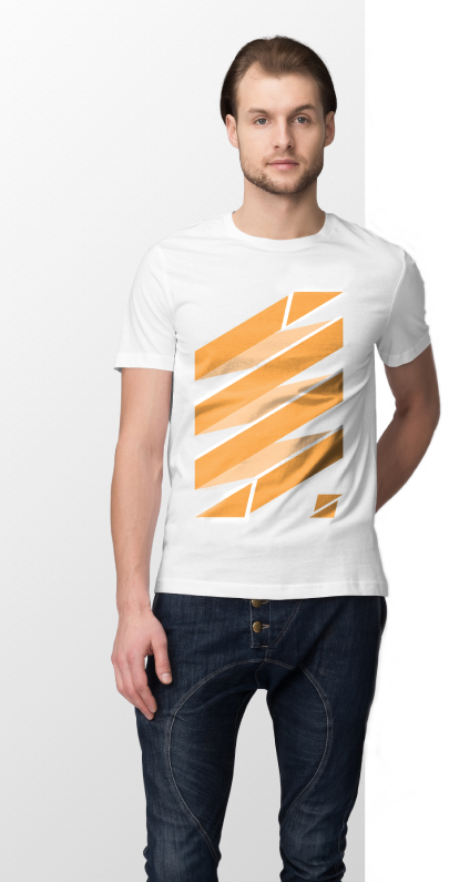
Each instance of merch was an opportunity to create a memorable impression. In this case, I did not want to simply throw the logo on a shirt and call it a day. Rather, I took the opportunity to make a shirt that people can wear in more situations than that of a logo placement. Here, the graphic created becomes a fashion statement, fitting into the street wear fashion movement. Utilizing the energy of the logo, I created a minimalist representation of a file going between devices.
COMMERCIAL CONCEPT
One of the premiere commercials for the product not yet used goes as follows. The song “Cha-Cha Slide” was chosen to fit the needs of the ad. First, selctions of lyrics were identified, specifically: “Slide to the left, Slide to the right, Criss cross, criss cross, Cha cha real smooth”
“Everybody clap your hands…”
Featuring name recognition, using “Slide to the ___” theme allows people to identify the name. During this part of the song, we feature a person walking down a city street dancing to this song in their headphones. Showing contrast between the hustle and bustle and monotony of the city. Meanwhile, this person is in bliss and in their own little world jamming to music. “Slide to the left…” Easily sliding a file from his phone to someone on the street; animated lines shooting outward taking inspiration from the Bruno Mars ‘That’s What I Like’ music video, using motion graphics to highlight movement and add value. “Slide to the right”, another file transfer to someone else on the street; slowly changing the hustle and bustle to happiness spreading from person to person.
These moments start to show the network these transfers soon create, a true peer to peer environment. Everyone has files the send, absolutely everyone in this age.
“Criss Cross…” Now files jump from person to person, spreading in a criss cross fashion and taking over the city. The city lights up with brand colors and animated graphics, tying in the illustrative aspect of the brand. Later, we showcase “Everybody clap your hands” and this is the peak of the commercial. The clap’s high energy creates excitement and unity. When each beat of the clap hits, we feature a different instance or way a file can be transferred. Quick beats showcase people of all backgrounds: teachers, students, companies, artists, developers, using their phones, tablets, macs, PCs, and more. This is how we showcase the large amount of functions and dynamic target audience for the product.
UI/UX PROCESS
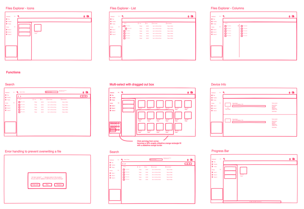
Innovating file transfer first meant that research had to be conducted on the current space and identifying pain points for users. We scoured competition, both direct and indirect to compile a list of observations regarding both form and function. Using a iterative process, various versions of the UI evolved over time, based off of the culmination of research and observations. We not only based decisions off of our team of experts, we also went through processes of user testing and focus groups to develop and hone in on the most efficient and appealing interface possible. From sketches to interactive mock ups, to the final coded interfaces tied to the back end.
PATENT INVENTION
One of the functions of the application that we legally protected involved an innovation I created around the concept of the clipboard. Traditionally, users are used to clipboard features such as “copy, cut, and paste” on their computers. However this lacked its next evolution. As SlideDrive is designed to be the new and improved file explorer for your devices, this needed to be improved. I developed this clipboard unlike anything seen before, offering new ways to transfer, manage, and interact with your files. Usual clipboards lack the visual aspect, copying text to your clipboard was not a clear process, the inability to see what is in your clipboard leads to mistakes.
I created a visual clipboard that is always visible in the interface, a place to temporarily hold files. Reminiscent of an ‘icon view’ in a file explorer, here you can see files placed and gain useful features to manage them. This offers an option to hold files from various locations across your device(s) as you collect them in order to have them all send in a group at once to a designated person or group. Allowing you to “full send” the files all together to another device of yours as well, to move them to their new location, an easy way to keep track of your files. Clicking the option to copy to clipboard or simply dragging and dropping will get you started. Offering the ability to clear the clipboard or individual items furthers the dynamic use. A resting place for files as you use the application as you need, the visual clipboard allows you a variety of new file transfer processes to fit your work flow.
YOUR NEW FILE EXPLORER
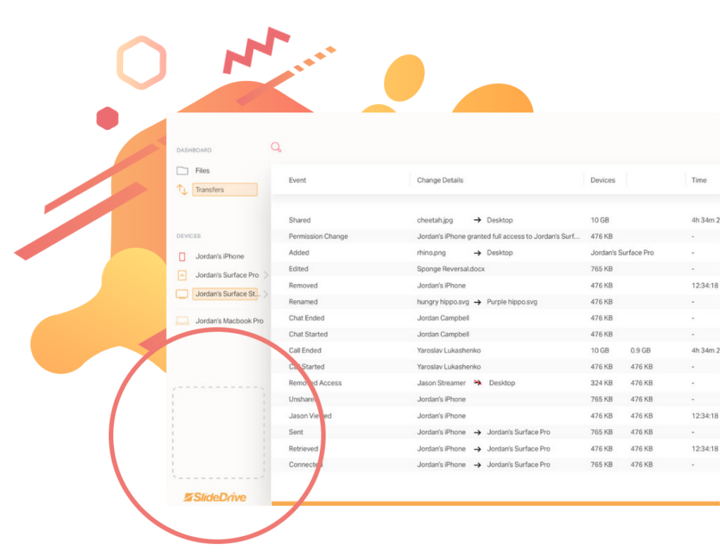
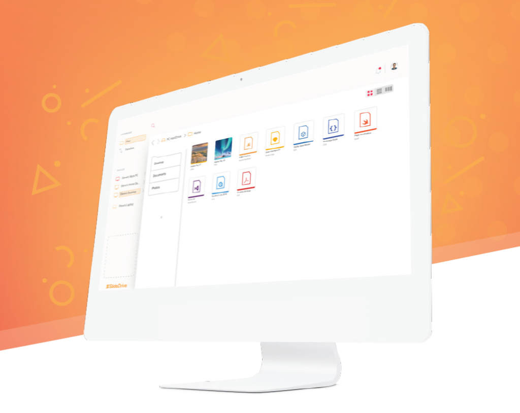
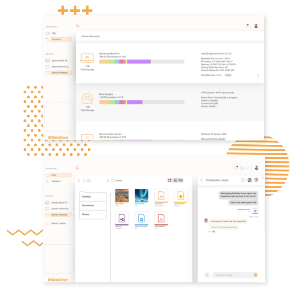
SlideDrive is designed to be the go to way to manage all of your files, even above your default file viewer/explorer such as Finder. To achieve this, our research provided opportunity to jam pack the application with various methods to transfer a file; allowing you to choose the best for your work flow. SlideDrive exceeds the default file explorer in another instance by making it natural to manage files on another device, just as if it were the device you were on. A truly seamless experience across devices between phones, computers, and tablets regardless of operating systems. We saw a pain point that some file transfer and storage applications do no allow you to send folders, causing you to have to add an extra step of zipping the file before sending. However, with SlideDrive we made it all automatic, making it as easy as possible to send a folder of files. Tracking and logging file movements and updates only adds security and peace of mind to know where you files are at all times.
We also acknowledge that there is rarely a scenario where you send a file to someone without some sort of message, a note of what the file is, otherwise you would get a random file with no context. This opportunity pointed us to the direction of not only innovating file transfer, but communication around file transfer. It is important to employ the same security to your messages as you do for your files, hence the application expanded to offer secure messaging. Expanding even more so, the applications path would evolve into adding other features to aid in your daily workflow such as audio and video chat functionality.
