MUSIC ILLUSTRATION PACK
A set of illustrations sold to designers in the music industry.

OVERVIEW
After reviewing my career, I realized I had designed for clients, for school, for a boss, for my companies, for friends, for myself, but never for other designers. I’ve used assets and materials made by other designers before but I have not been a part of creating for my own industry. I set out to create just that, resulting in an illustration pack based off of a culmination of market research and observations to properly position it. A full study and thesis went into the development of this pack, however only small pieces of the research and findings are shown.
TASKS
- Illustration
- Market Positioning
- Illustration Style Thesis
PACK:
The illustration industry is largely influenced by well, itself. Designers draw from inspiration from one another, creating and developing styles evolving off the original. In order to get a pulse on the industry, one must pay attention to where the inspiration comes from and what it is. Website’s such as pinterest or dribbble are a landscape of innovation and trial. No matter where a designer works, their work often stems from what is popular in the industry. Looking at what does well on these sites will give you insight into popularity, niches, and opportunities.
One of the main opportunities identified was the lack of compelling foreshortening and perspective in graphic design illustration. As a result of the isometric trend that happened years ago, illustrators are still feeling the impact of the strict perspective rules. Even illustrations not within the isometric style were presenting simple perspectives, such as a straight head one view, lacking energy.
If designers are seeking to purchase an illustration pack, they either are doing so to save time or because they do not have illustration abilities.
After analysis of the evolution of illustration styles over the years, certain patterns were realized. There is often a shift towards minimalism and a shift away from it, constantly fluctuating. Currently the up trend is towards minimalism, simplifying shapes, shading, color, etc. The industry will always seek to evolve, to change. One trend becomes popular, then dies off soon after. As technology evolves, styles as well seek to fill voids. Now that screen resolutions have improved, vector illustration has become popular, as you can no longer worry about the pixelated edges seen on low quality screens.
SOLUTION

CUSTOMIZATION
Not all designers are illustrators, often they rely on packs of illustrations in order to complete their projects. Another reason designers purchase this pack is to save time for their projects. Taking that into consideration, I set the project files of each asset to be as customizable as possible, as fast as possible. Keeping each task just a few steps in order to change the illustration to their needs.
PERSPECTIVE & FORESHORTENING
To address one of the main issued I identified, it was essential to create interesting perspectives with foreshortening and placement. The angles help give energy where a straight forward or side view lacks just that.


GROUNDING
In order to help relate the foreground to the background, I chose to use subtle shapes to ground the piece. I complemented the complexity of the object with the minimal aspect of the shapes. Each helped make the illustration standout with shapes carefully composed to add value to the energy in the perspective.
CHOOSING THE INDUSTRY
Entering the market meant finding a gap in the market. After understanding who uses illustration pack assets, in a broad sense designers, it was then to understand what projects they are designing for. I identified the impact that the tech industry has had on influencing design, with the tech industry moving more towards illustration, I saw other industries starting to follow. Looking at the industries projected to have the most new businesses, I saw the music industry was among them. After researching the largest asset stores for music assets, I witnessed the gap.


Uses
The pack’s illustrations can be used for print, digital, motion, and more. The biggest intention however gears the illustrations towards web design, as to adhere to the direction with the most need.
HAND DRAWN OUTLINE
The choice to draw the outline by hand added a level of control to the depth of the illustration. In order to highlight the foreshortening, the thickness of the line varies.


CHOOSING WHAT TO DEPICT
-Using the most versatile symbols throughout music to allow for the most amount of use and adoption
-Mixing modern and vintage
-Choosing items that work together, that way the designer can use multiple rather than simply buying the pack to use one or two. The set works best when used together to build the brand.
-Avoided using humans as to not conflict with other illustrations the company may use, conflicting styles of illustrating humans will bring down the brand.
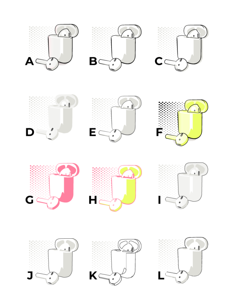
Variation Process
- Hand Drawn Outline, Cell Shading, Base Color, Gradient, Ground Shadow
- Hand Drawn Outline, Cell Shading, No Base Color
- Hand Drawn Outline, Cell Shading, No Base Color, Offset Shadows
- Cell Shading, Base Color, No Outline
- Hand Drawn Outline, Cell Shading, No Base Color, Muted Outline
- Hand Drawn Outline, Cell Shading, Color Base
- Hand Drawn Outline, No Base Color, Color Outline, Color Shadow
- Colored Hand Drawn Outline, No Base Color, Cell Shading, Different Color Shadow
- Fixed Width Outline, Cell Shading, Base Color, No Shadow
- Fixed Width Outline, No Base Color, Cell Shading
- Fixed Width Outline, No Color, Shadow Outline
- Sketched Outline, Cell Shading, No Base Color, Muted Outline

